Strategic Design Rooted in
Human Behaviour.
By combining deep psychological research with high-fidelity execution, I build digital products that are as functional as they are beautiful.
Validated by Research
Structured by Design
Guided by Voice
Built for Performance
Why do I do this?
Because I love it
UX Research & Strategy

targeted, evidence-based research to validate decisions and reduce development risk.
I connect assumptions and user reality to build products that people need.
The “How”
- Generative Research: Stakeholder Interviews, User Surveys, and Field Studies to discover new opportunities.
- Evaluative Research: Usability Testing (Moderated/Unmoderated), Card Sorting, and Tree Testing to refine existing flows.
- Strategic Synthesis: Competitive Benchmarking, User Personas, and Empathy Mapping to align the product squad.
The Proof
- Actionable Research Reports: No 50-page decks; I deliver concise, “at-a-glance” insights with clear priorities.
- User Journey Maps: Visualizing the end-to-end experience to identify “drop-off” points and “wow” moments.
The “How”
- Information Architecture (IA): Crafting the structural “skeleton” of the product to ensure users never feel lost, regardless of the site’s complexity.
- User Flow Mapping: Designing the optimal “happy path” from initial landing to final conversion, eliminating dead-ends and friction.
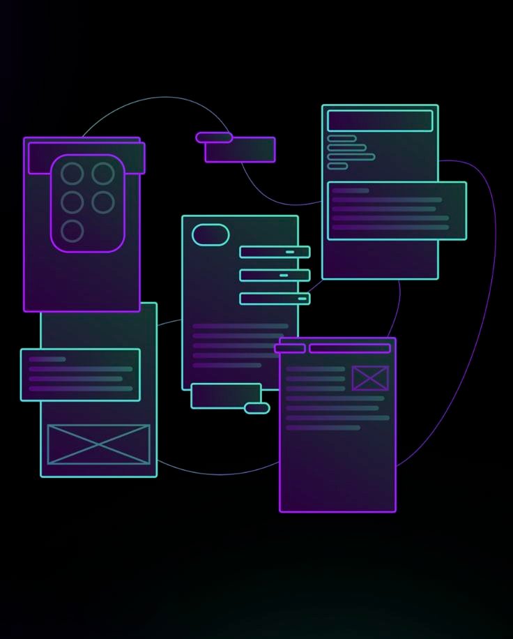
- Interactive Prototyping: Building clickable, high-fidelity simulations in Figma to test logic, animations, and transitions before a single line of code is written.
- Wireframing (Low-to-Mid Fidelity): Establishing the hierarchy and layout of every screen to focus on usability and core functionality without the distraction of visuals.
The “Proof“
- Comprehensive Sitemap & Flowcharts: Visual maps that serve as the “Source of Truth” for your engineering and product teams.
- Interactive Figma Prototypes: Fully functional “walkthroughs” used for stakeholder presentations, investor pitches, and final user testing.
- Component-Driven Layouts: Modular designs built for scalability, ensuring that as your product grows, the UI remains consistent.
- Dev-Ready Interaction Specs: Clear documentation of animations, hover states, and logic to reduce “translation errors” during the handoff to developers.
UX Design
I transform complex user requirements into intuitive, high-performance digital interfaces.
I design the logical “connective tissue” that ensures a product is as easy to navigate as it is beautiful to look at.
UX Writing

Clear, concise, and user-centred content that enhances digital experiences
The “How”
- Microcopy Design: Crafting the precise language for buttons (CTAs), error messages, and success notifications to ensure users always know their next step.
- Voice & Tone Strategy: Developing a consistent personality for your product—whether it’s authoritative, playful, or supportive—to build long-term brand trust.
- Onboarding Flows: Writing the “First-Time User” experience to reduce the learning curve and get users to their “Aha!” moment faster.
- Accessibility & Inclusion: Ensuring all copy is screen-reader friendly and uses plain language that is easily understood by diverse global audiences.
The “Proof”
- Voice & Tone Style Guide: A foundational document that ensures every writer, designer, and developer “speaks” with the same brand voice.
- Content Inventories & Audits: Analysing existing site copy to identify jargon, confusing terminology, or “dead-end” messages.
- Instructional Tooltips & Labels: Clear, concise “help” text that solves user problems before they have to contact support.
- Conversion-Optimised CTAs: A/B tested button text designed to increase click-through rates and reduce cart abandonment or form drops.
The “How”
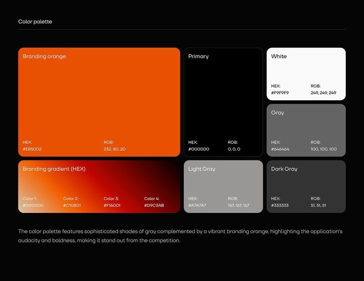
- Visual Identity & Branding: Defining the core visual DNA—typography, colour theory, and grid systems—to ensure a cohesive and professional brand presence.
- Custom WordPress Development: Building flexible, scalable websites using industry-standard builders (like Elementor or Bricks) and custom themes that are easy for clients to manage.
- Front-End Optimisation (HTML5/CSS3): Writing clean, semantic code to customise layouts beyond the limitations of standard templates.
- Responsive & Adaptive Design: Ensuring a “Mobile-First” approach so the site performs flawlessly on smartphones, tablets, and ultra-wide monitors.
The “Proof”
- Interactive Design Systems: A library of reusable UI components (buttons, cards, forms) that ensure visual consistency and speed up future development.
- Performance-Optimised Sites: High “PageSpeed” scores achieved through image optimisation, clean CSS, and efficient plugin management.
- Cross-Browser Validation: Rigorous testing to ensure the site looks and functions identically on Chrome, Safari, Firefox, and Edge.
- SEO-Ready Architecture: Structuring headers, metadata, and site maps to ensure your product is easily discoverable by search engines from day one.
Web Design